Form follows function: Comprehensive guide to form fields
You've been looking for an insanely detailed guide to form fields for quite some time?
We've heard you and today we deliver. Find all of our tips, tricks, and advice on form fields in this most comprehensive guide to form fields on the web!
Without any delay, let's dive right in.
U, I, and the form fields
Although they may seem simple at first, there is a lot of thought involved in form creation. Form fields seem to have a life of their own, and they are an integral part of almost every website: whether it's just a simple "Contact us" form or 5-step checkout.
So, to answer the question: Yes, form field design is essential and, I would dare say, crucial for a better user experience, especially in e-commerce.
Form fields should be designed so the users can complete them effortlessly, with as little confusion as possible. Since we all know users don't read websites, they scan them; the same goes for forms.
Two main factors determine whether a user will complete filling in the form: perception of complexity (aka. how big the form is) and something called interaction cost.
Interaction cost is, to put it simply, the amount of effort it takes to complete a goal. The more effort it takes to complete the form, the less usable it is.
The red herring
red herring noun
; something intended to divert attention from the real problem or matter at hand; a misleading clue.
There are a lot of technical requirements for both usability and accessibility that go into a good form design. A basic rule of thumb is: the shorter, the better.
We all know it's better to organize information in chunks. They help us better understand and remember information, so when it comes to e-commerce, we usually design a multi-step checkout process. It makes the experience easier, right?
Well, not really.
Contrary to the current state of checkouts, the number of completion steps has little bearing on whether the users abandon their orders. Actually, according to research done by Baymard Institute, the number of form fields has a significantly bigger impact on overall checkout usability than the number of steps.
And even though one of the main reasons for shopping cart abandonment is a too complicated checkout process, many websites still use an average of 11.8 fields! Most of those could be reduced by 20 - 60%, and the experience would be much better, with the ideal number of form fields being only 8. That's all most websites need.
Each additional field makes the completion process harder, and thus, it’s easier to lose prospective users. And this certainly seems intuitive: Less effort on the user's part will lead to higher conversion. So next time you are designing a form, try to minimize the number of fields as much as possible.
What you want vs. what your users need
I get it; you want to collect as much data about the users as possible. I know you want higher conversions. But is it worth losing potential customers just so you can fill a database? Think about the information you need at the moment.
Ask yourself: "Can I get this information from another source (e.g., IP address)? Will this information bring me closer to a sale?". Context matters a lot.
Sometimes an email is enough to get you started, and you can always ask for a follow-up after the process is complete. Sometimes you need to ask additional questions. Sometimes you need to bust the best practice.
I know this seems contradictory to the above rule that says "keep it short", but it's not if you think about it. You can have fewer form fields; just ask the questions users want to interact with. Don't make them think, "Why do I need to fill this out?".
Michael Aagaard is Unbounce‘s former senior conversion optimizer and an advocate for conducting conversion research instead of relying on best practices. Determine what fields the users are most engaged with and keep those. Instead of asking more questions, ask high-value ones.
If you decide to include optional or "nice to have" questions, make sure to distinguish between mandatory and optional fields. Since most of them are NOT optional, it’s logical to highlight those who are. But, that's not a common practice.
An asterisk (*) has long been determined as an indicator of mandatory fields, and the users on the web are familiar with that practice. It's usually red, though that doesn't have to be the case; just avoid low-contrast colors or grays for better accessibility.
The temptation NOT to mark required fields but instead show instructions at the bottom of the form, or only mark the optional fields will lead to confusion and frustration since most users don't read the instructions.
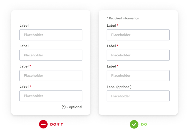
If you opt for marking the optional fields, add the word "optional," which reduces the user's cognitive load. Also, make sure to align this text next to the top label and not the right of the input field.
Reducing the cognitive load: Rules for better form usability
1. Group similar data
Grouping fields into categories such as “Personal” or “Social” makes the form easier to scan. This is especially true for long and complex forms because we don’t want the users to give up mid-way.
One great example of this is a multi-step checkout we talked about before: Users are presented with smaller chunks of data which make them easier to process.
This is a so-called One-thing-per-page flow. The upsides to this approach are that the users concentrate on one complex entity at a time, errors are caught earlier, and it adds a sense of progress and momentum.
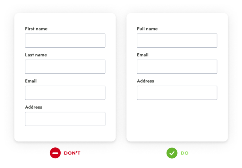
Another good practice is to avoid slicing data fields, as this makes the user take extra clicks or taps to move on to the following field.
The most famous example is the name field. Baymard conducted many checkout usability studies and observed how users generally think of their name as a single entity. Consequently, 42% of the users often type their full name in the “First name” field (present company included).
And yet, 66% of sites have two fields for simply entering a name, while 20% have additional fields, such as “Suffix” or “Middle Name”. Do you ever fill out those? I don't.
Since the task of writing your name should be simple, there is no reason to split it into two fields and make your users take the extra effort right at the beginning of the process. It also makes the aforementioned perceived complexity higher than it should be.
This is especially true for mobile devices, where screen estate is precious.
2. Order in the court
The order in which the form fields appear should be logical from a user’s perspective. Treat it as a conversation, and ask questions as you would if you were meeting a new person in a real-world situation. Think about it: What information would you reveal first?
You would most likely introduce yourself by stating your name and then follow up with other basic details.
It makes sense to transfer this approach to an online form; that's why the checkout starts with the „Full Name” field. There is also the principle of familiarity: Users are used to specific patterns, and changing them could cause confusion and a delayed response.
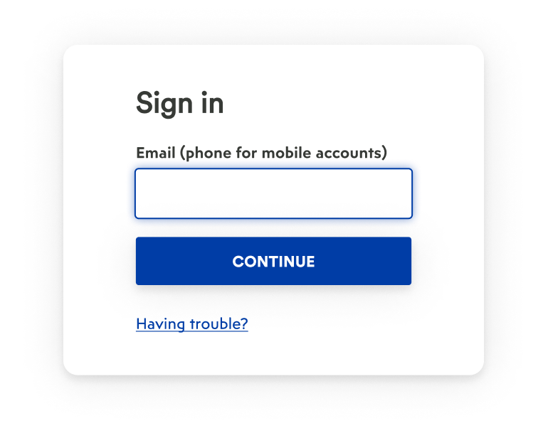
A good practice is to auto-focus the first field in your form. Why? Because it reduces the interaction cost by giving the user a starting point and saving them a click!
3. Easy before difficult
If you opt for having additional questions in your form, place the most complex ones last. If your form is long and must be completed in a single step, hide optional questions behind a link.
Baymard testing showed that users are much less impacted by fields hidden behind a link since there is no open form field to fixate on. Users who wanted to fill out those additional fields have always been able to find them.
Want to hear a good tip for simplifying the checkout process?
Hide the „Address Line 2” and „Company” fields. They are typically optional and only needed by a small subgroup of users.
4. Don’t mask the password
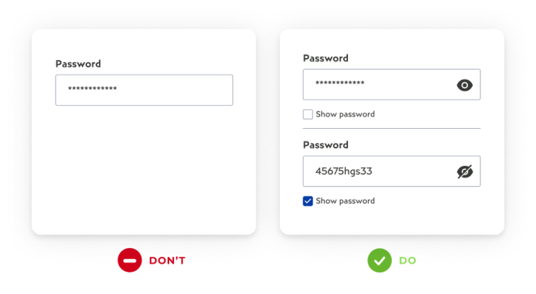
The main reason for confirmation fields such as “Confirm password” is that users don't make errors, e.g., typing in the wrong password. This, however, doesn't work since most users copy-paste the password from the first field to another, especially if they can't see what's in the field.
Jakob Nielsen summarized: "Usability suffers when users type in passwords, and the only feedback they get is a row of bullets. Typically, masking passwords doesn’t even increase security, but it does cost you business due to login failures."
Ah, see, the nifty little eye icon in the right corner isn't there to look pretty or add "something extra" to your design.
It has an important function that allows for a more seamless and more straightforward user flow. If you don’t want to use the icon, you can add a checkbox below the "Show password" field.
5. I spy with my little eye – a single column!
A study states users scan the website rather than read it. The same goes for forms. The best way to organize them is a single-column layout: it's faster to scan than a multi-column layout, and the completion time is on average 15.4 seconds faster. That's a significant difference!
Also, mobile devices nowadays tend to be longer, and vertical scrolling is a natural motion for mobile users. Keep this in mind next time you are adapting a website for smaller screen sizes.
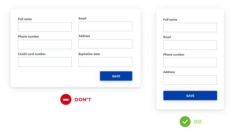
The problem with a multi-column form is that it dramatically increases the number of eye fixations and the time it takes to finish it. The second one is that users can skip relevant information since we all scan things differently, especially if the columns aren't equal in width and number of rows.
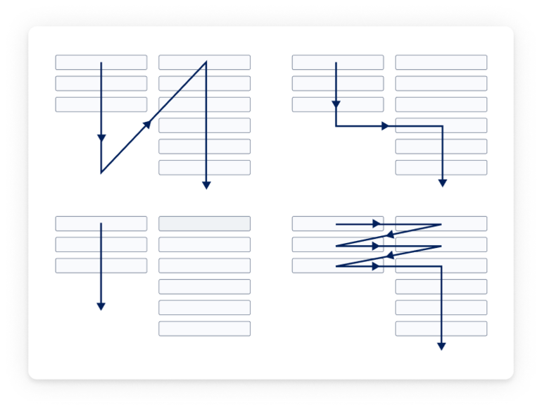
If you, for some reason, need to have a multi-column form, it's better to have a call to action button for each section. Ensure you have enough white space between those sections or a divider to separate all of them clearly.
6. Maximize speed
Small touch targets, which need to be selected precisely, lose approximately one second of the user’s time. Switching from a keyboard to a mouse and vice versa takes on average 400ms, and using a mouse to navigate between fields and getting ready to type takes on average 1900ms.
So it makes sense to make the users stay on the keyboard while filling out the form. Second tip: Use autofill. It lowers the completion time by an impressive 30%.
And those optimal eight field forms? They make tabbing three times faster (5,9 sec instead of 15,2). For mobile devices provide users with a matching keyboard.
If the users need to enter the credit card information, they should see a dial pad, not letters. This works for both native apps as well as mobile websites.
Form elements and usability
Let’s say you’ve never created a form and need somewhere to start. The first thing you should know is that forms fields consist of the following: Input field, label, action button (preferably one for submitting), and validation (error and validation messages).
If you want a more in-depth article about how to create elements of a design system, I’ve got the right one for you.
1. Labels
Let's start with field labels. A label is a text which tells us what information to put in a particular field. They should be short, ideally a word or two, to guide users through the forms. Labels are necessary since visual differentiation of elements most of the time is - not enough.
According to research, top-aligned labels work best. They improve the way users scan the form, they are the best choice for mobile devices, and they provide more space just in case the label needs to be a bit longer. But be careful! If you need to describe the input field in more than a few words, it's better to use the additional text below the field for clarification.
Left-aligned labels may look nice, but they don't transfer well to mobile as there can be problems with cropping, zooming, and dense wrapping.
If you opt for the “no placeholder” form you need to take into consideration the following: The lack of a label means a placeholder has to take its role and describe what input is expected.
These are called adaptive or floating labels, and they are an excellent way to save screen estate, especially on mobile. The label first acts as a placeholder, but on focus, it is aligned to the top, making a place for the input text.
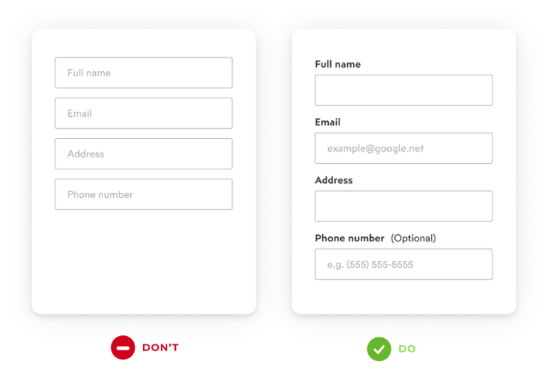
Having only placeholders on your form and not using (floating) labels is not a good practice. Whenever the user selects the field to add input, the placeholder disappears, making it harder to enter the correct information. Disappearing placeholders will strain the user’s short-term memory and make it impossible to check if the inputs in the form are correct before submitting it.
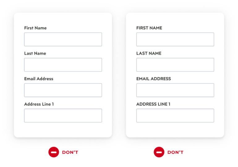
Case type is also important. Imagine if form labels Were All Written Like This, OR LIKE THIS. There may be a few words to read, but it still strains the eye, especially in longer forms. Title case and all-capital print slow scanning and reading speed compared to a lowercase type.
2. Input fields and placeholders
Input fields should be big enough to accommodate a bigger font and a comfortable touch target. The rule of thumb for fonts is to not go below 16px, ideally, 18px and above, especially when designing for iOS.
The length of the input field should indicate the amount of information expected from the user. Generally, fields such as ones for area codes and house numbers should be shorter than ones for street addresses.
There is a lot of discussions about whether placeholders are necessary or not. Nielsen Norman certainly thinks they aren’t. Their argument is that empty fields are easier to scan, but as such should be accompanied by floating labels or instructional text.
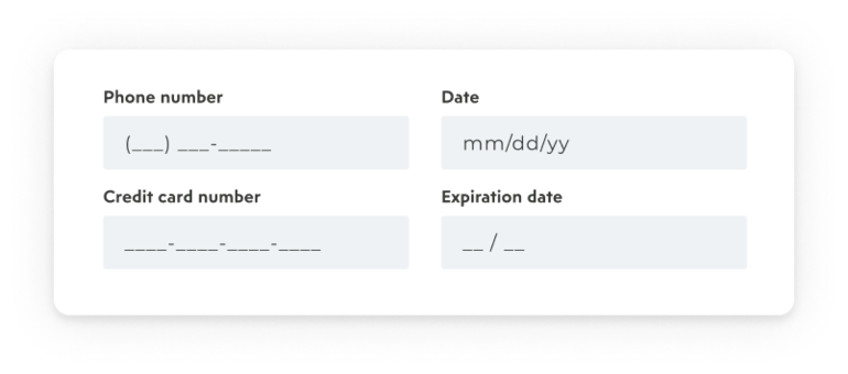
Placeholders however are extremely valuable for specific data formats such as phone numbers or date of birth. Users can sometimes mistake them for a pre-filled value and skip to the following field, so you need to be careful and choose a text color that clearly indicates the form field is not pre-filled.
Another good UX practice is to avoid making the users delete the placeholder text manually. It wastes a lot of time and slows down the momentum.
Now, we must mention field masking. No, it’s not the same as a placeholder.
It’s a technique that helps users format inputted text by using parentheses, spaces, and dashes that appear on the screen automatically while typing. It’s extremely helpful for more complex data formats such as phone numbers.
3. Feedback (error messages and validation)
In short, inline validation is a line of text that gives positive or negative feedback during the process of filling in the form, in order to help the user enter the correct information.
The benefit of inline validation is the lack of frustration and even form abandonment since the user can submit the form at the first attempt. More attempts mean a higher possibility of users giving up completely.
When it comes to providing valuable user feedback, inline validation works best because it displays that information at the input field level. This placement corresponds with the user’s natural top-to-bottom reading flow, and the errors will appear in the context of the user’s input. According to Luke Wroblewski, inline validation decreases completion times by 42% and increases the success rate by 22%.
Dynamic validation takes into consideration the time at which you choose to display an error message or validate input.
The principle here is, “Reward early, punish late.” Seeing an error message after pressing the submit button can cause frustration. Same with premature error signaling, e.g., when the user has only typed a few characters.
The better solution here is to set a limited number of characters for each input, and once this threshold is reached, start showing errors. Also, error messages should be clear and neutral. Avoid vague phrasing such as “Something went wrong. Please try again later.”.
Users need to know exactly what went wrong so they know how to correct it.
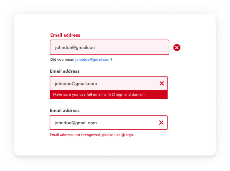
Similar principles apply to validation messages. Avoid showing inline validation on focus and show “Success” only if the user has moved on to the following field.
As for the user interface (UI) part, designers should use color to highlight or complement what is already visible. What are the two colors you reach for the most in these elements? Are they red and green?
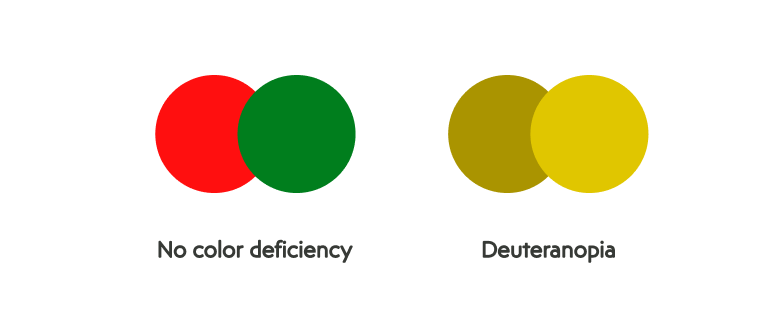
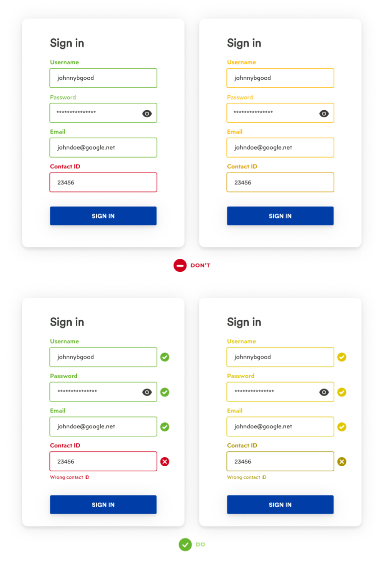
While this is a logical choice and certainly a familiar one, you should never rely on color only to convey status.
Instead, use a combination of color and visual cues, such as icons and inline messages, as color blindness affects approximately 1 in 12 men (8%) and 1 in 200 women worldwide.
4. Action buttons
Action buttons are pretty straightforward. They have to be big enough, they have to look clickable, and the labels need to be descriptive, so the user knows what to expect when pressing them.
Design the button to clearly indicate the form is being processed or disable it after the user’s action, so you prevent double submissions.
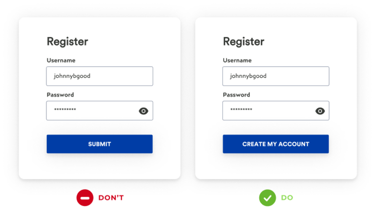
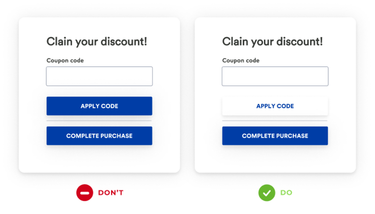
An ideal number of buttons is one, but If your form needs to have two calls to action buttons (for example, an e-commerce form that has “Apply discount” and “Submit order”), ensure a clear visual distinction between the primary and secondary actions.
As with the input fields, don’t rely on color alone to communicate status. Use color to highlight elements that are already visible and avoid using the red and green color combinations.
All you need to know about form fields
This ends our (the best on the web) guide to field forms. Yes, they require a lot of thinking and intensely depend on their use context. For the sake of users (and conversions), try to make them as easier as possible to fill. Users mostly abandon forms because of their complexity, whether it's the length, confusing questions, or unclear formatting.
Please don't make the users guess what they need to do. Forms are a lot of work as it is, so show compassion and create a good experience. Think about what is the most valuable information for your users, and if you do this right, you'll see a rise in conversions.
And if you'd like to know more or you're in need of assistance - reach out to us!


