Introducing Pimcore Studio
During the 2024 Pimcore Inspire conference, Pimcore introduced a highly anticipated and modernized new Admin UI called Studio. We had an opportunity to see the new Studio UI at first glance, and now we have the opportunity to share all the excitement.
ExtJS, the framework that is behind the current admin interface and frontend data management, is getting old, and it’s kind of in a downfall in terms of features, performance, and innovations. Most importantly, the community is in decline.
The most obvious choice was to turn to the modern technology stack, so there was extensive research made by the Pimcore team that included:
-
Market Research
-
Partner Surveys
-
Community Surveys
-
Technology Research
- Market Trends in Technology
- Community Scale
- Usability of Framework/Technology stacks
The aim of the new studio UI is:
-
Modern look & feel. UI / UX evolution
-
Clean & Simple Design
- Design System
- Layouts, Panels & Components
-
Extend & Customize
-
Better licensing model
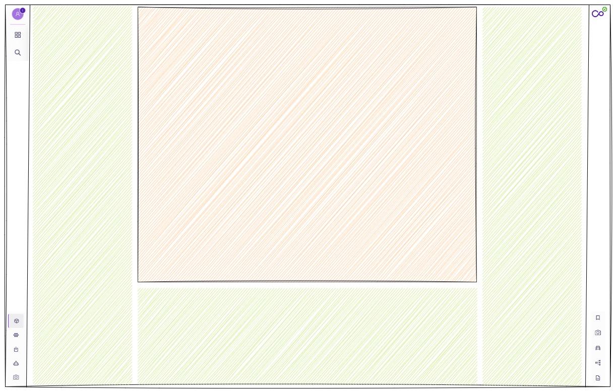
Main Stage
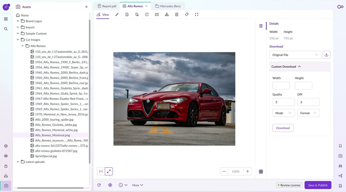
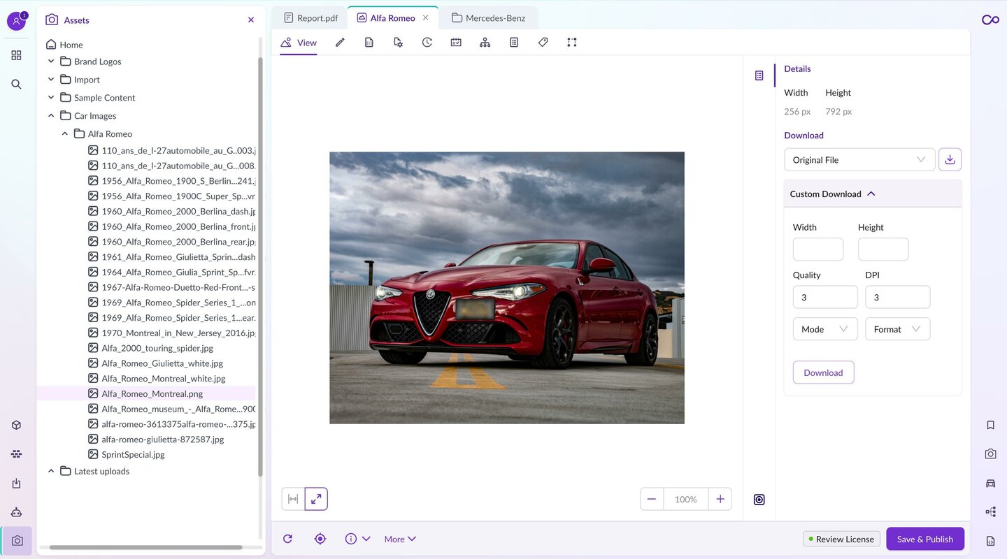
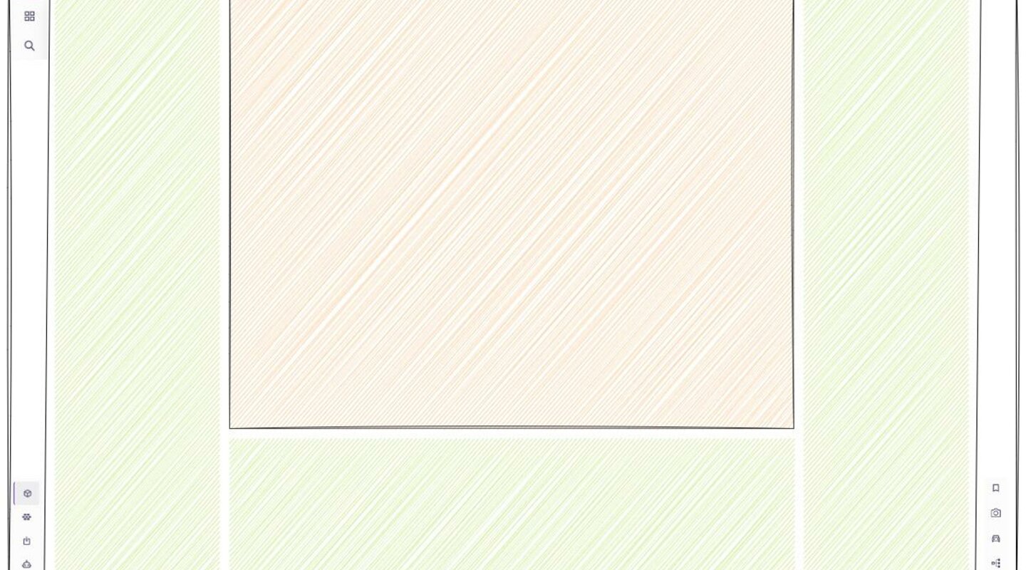
Pimcore's most important part of the UI is, of course, the editor (Data Object Editor, Assets Editor etc.), which will take up the main central stage on the screen.
Sidebar Areas
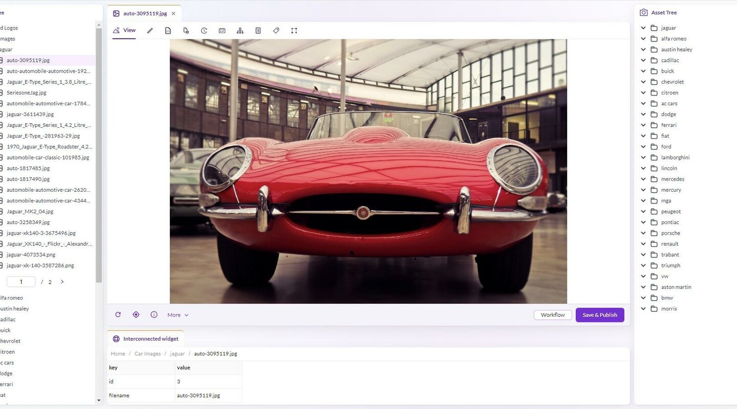
Sidebar areas are now containers for the widgets. These widgets will provide any kind of functionality that is useful to the user. The widgets arrangement can be arranged per user needs using simple drag and drop functionality.
Widgets and panels can be interconnected, which means that widgets can adopt content based on what editor is opened and what content is displayed in the editor. For example, when editing a new product, a widget could suggest similar or related products to the content creator based on the editor's content.
Following this approach, we can now compose completely different and dynamic user interfaces based on the needs of a user who is editing the content. Not only can widgets be applied to editors, but they could also be applied to grid views. For example, a new grid view will have an additional right sidebar where more refined search/filtering functionalities could be applied, which in legacy UI are now mostly hidden around the UI.
Left and Right Toolbars
Left and right toolbars are now simplified and clean, and are used to provide more functionalities, like switching between displayed widgets, search functionality, and mega menu. Clicking on the items will provide easy shortcuts to other important functionality in apps.
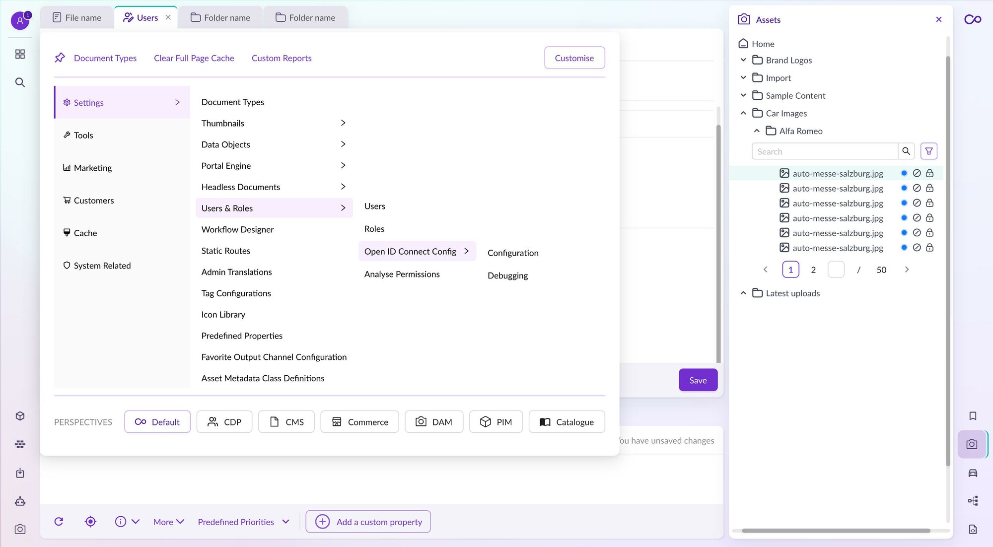
Mega Menu
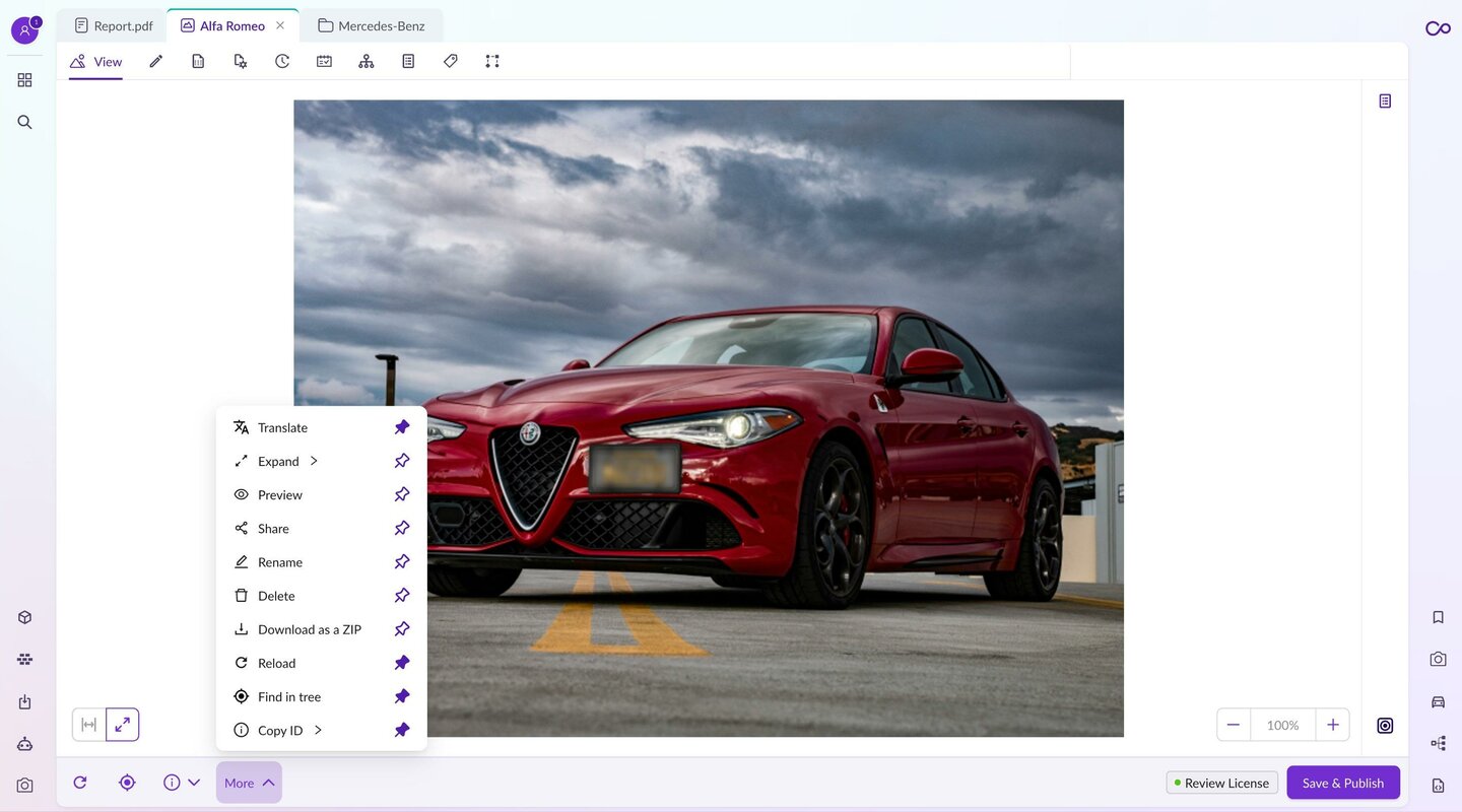
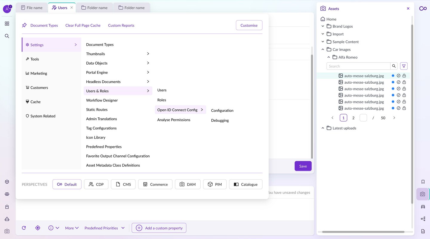
The menu in the new Studio UI is refined; it comes with reduced complexity and a cleaner, beautiful design, which improves efficiency. It also brings shortcuts that could be customized per user. Labels with icons are now replacing just icons that in current UI can be confusing, which makes work with items more efficient as we don’t have to manually find which icon is used for which group.
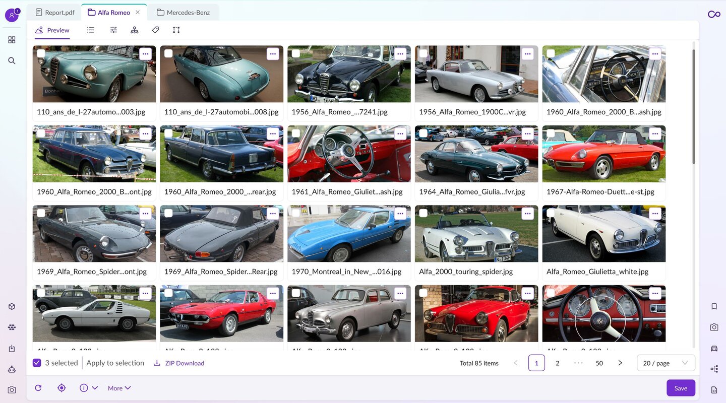
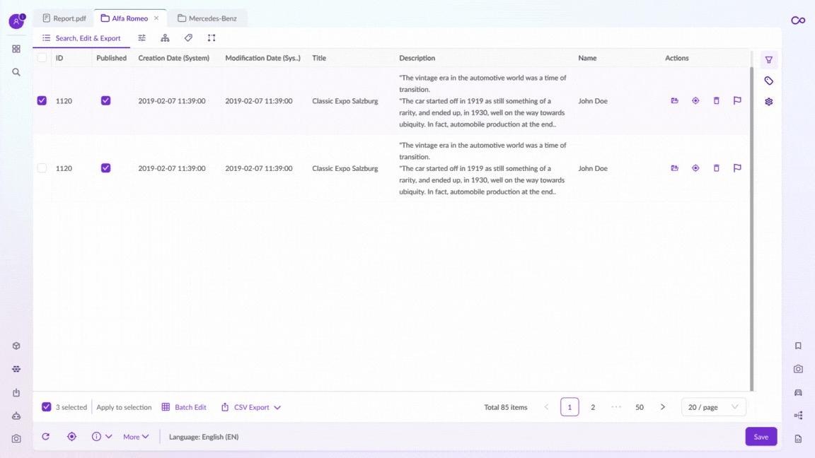
Grid view
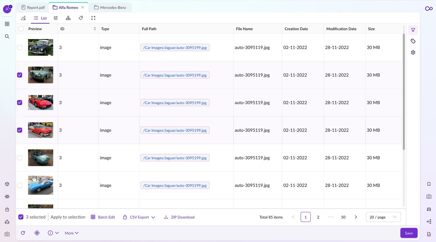
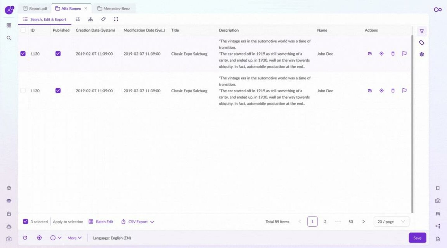
As mentioned above, we will also have applied sidebar widgets in the grid view. In grid view, search and filtering is now moved to the right sidebar, and it still provides immediate feedback when something is refined from the sidebar.
Grid view features all the functionality in older legacy UI, but it’s more natural, clean, and simpler to understand and use. The grid view itself is built on top of one of the most popular table library - the React TanStack table, which has 1.5 million weekly downloads.
One of the new features of the new grid view will be the introduction of Pimcore query language. Pimcore removed the functionality in Pimcore 10 using direct MySQL inputs. Now, they are bringing it back more powerful and more secure as it eliminates the possibility of SQL injections. The new filtering options will also provide the possibility to use Pimcore query language to further refine search results.
Main Search
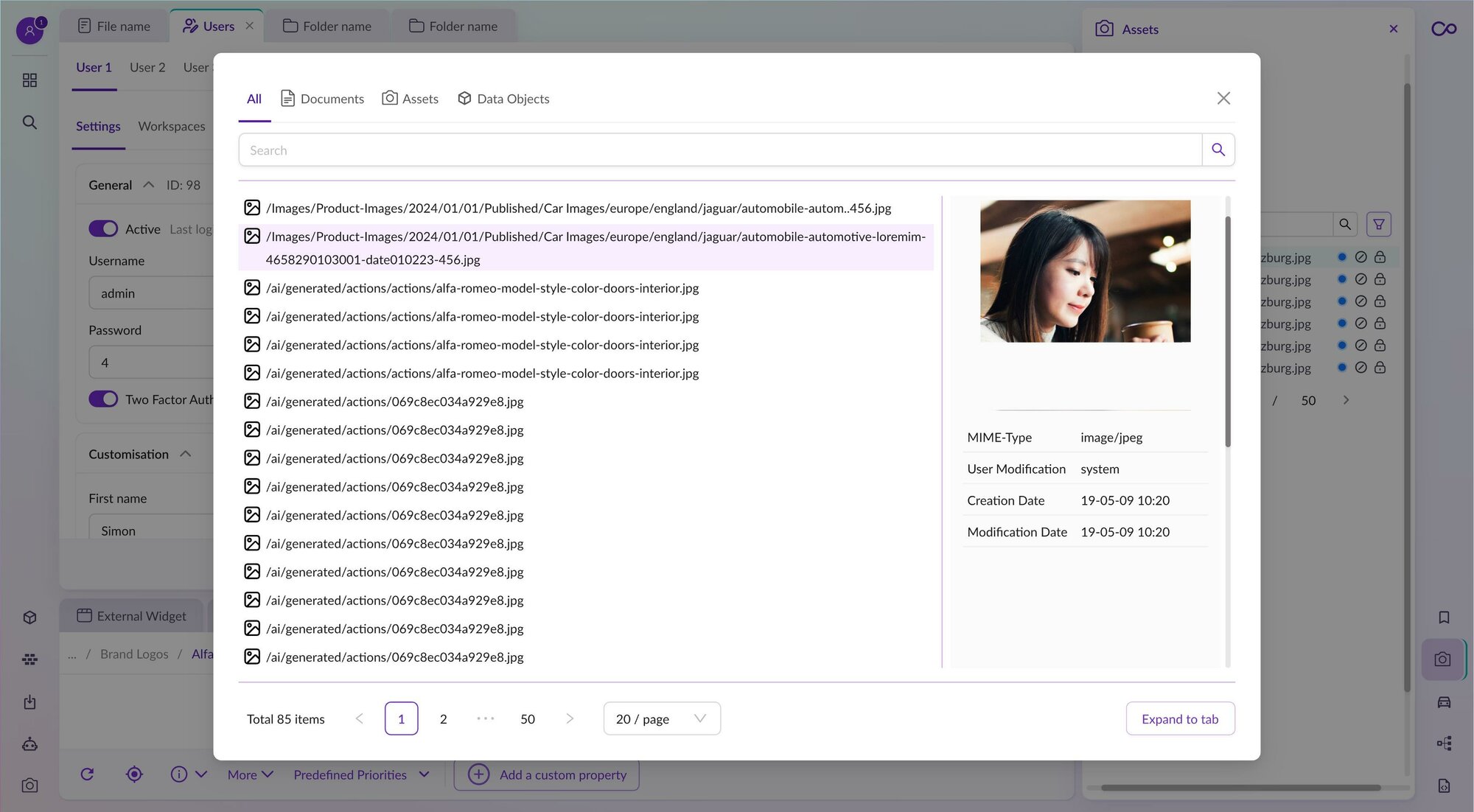
It searches all items, but now the search is much cleaner and easier to use. From there, more target searches could be applied by selecting the type of search (assets, data objects, and documents).
Search results will now be presented in gird view that can leverage the same functionality from main grid view, like grid customization and further filtering. Searches can also be saved for later reuse.
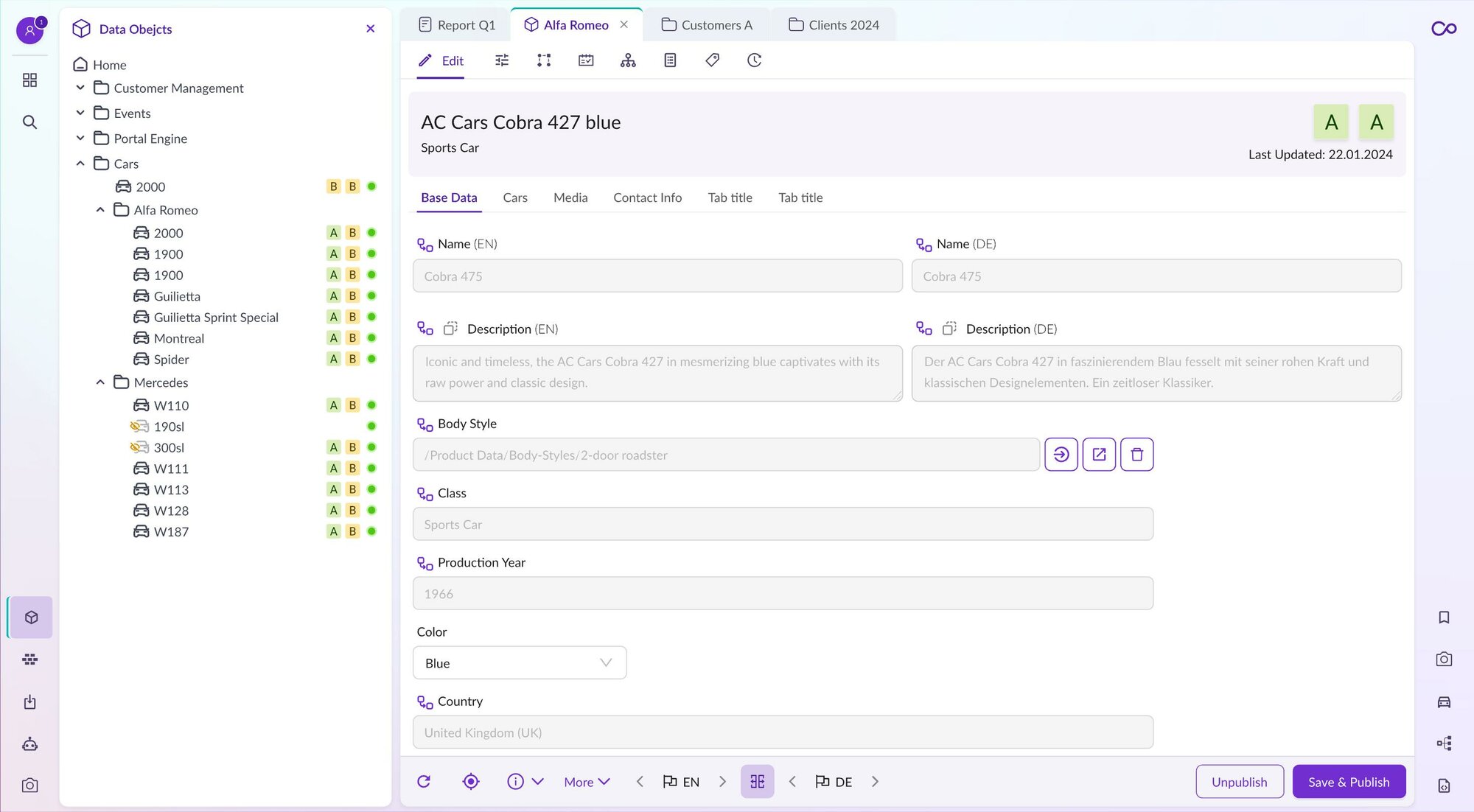
Data Object Editor
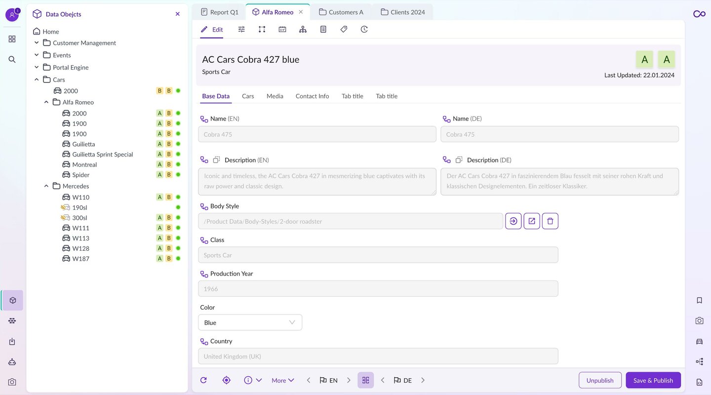
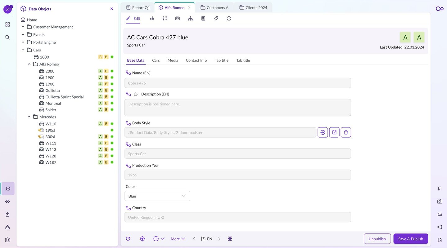
A new tree in data objects can now be displayed/attached with additional information, such as workflow steps and data quality scores.
The Data object editor in the new Studio UI is cleaner, with reduced tabs.
For example, a language switcher is now at the bottom and changes the language for all the fields in the object.
Speaking of translations, we can now have a split view for the localized field, which means we can see the data in the original language and work on the translation field side by side.
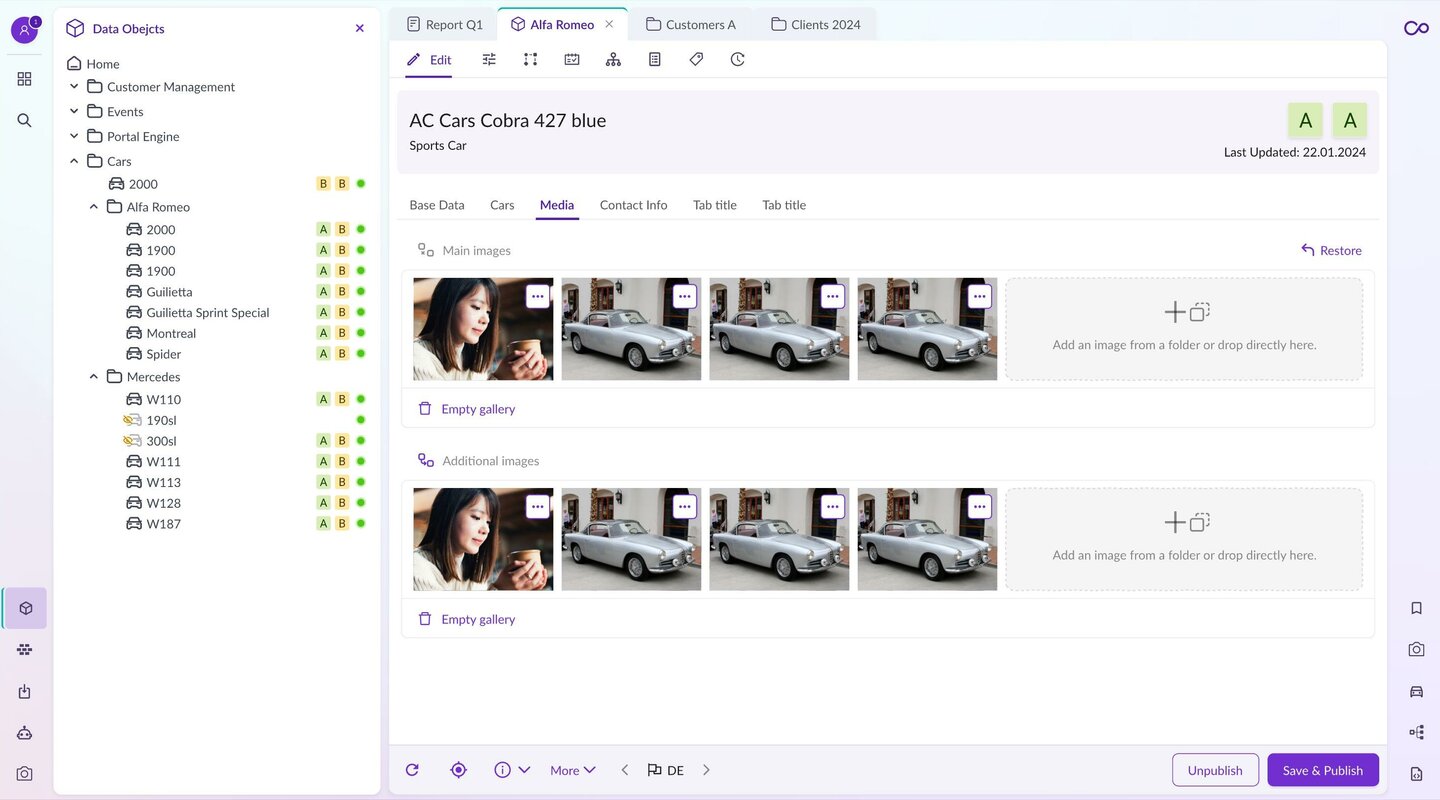
The gallery/image data types have also been improved and redesigned. They are much cleaner and more natural to use and understand.
Data object grids features all the functionality from the previously mentioned grid view.
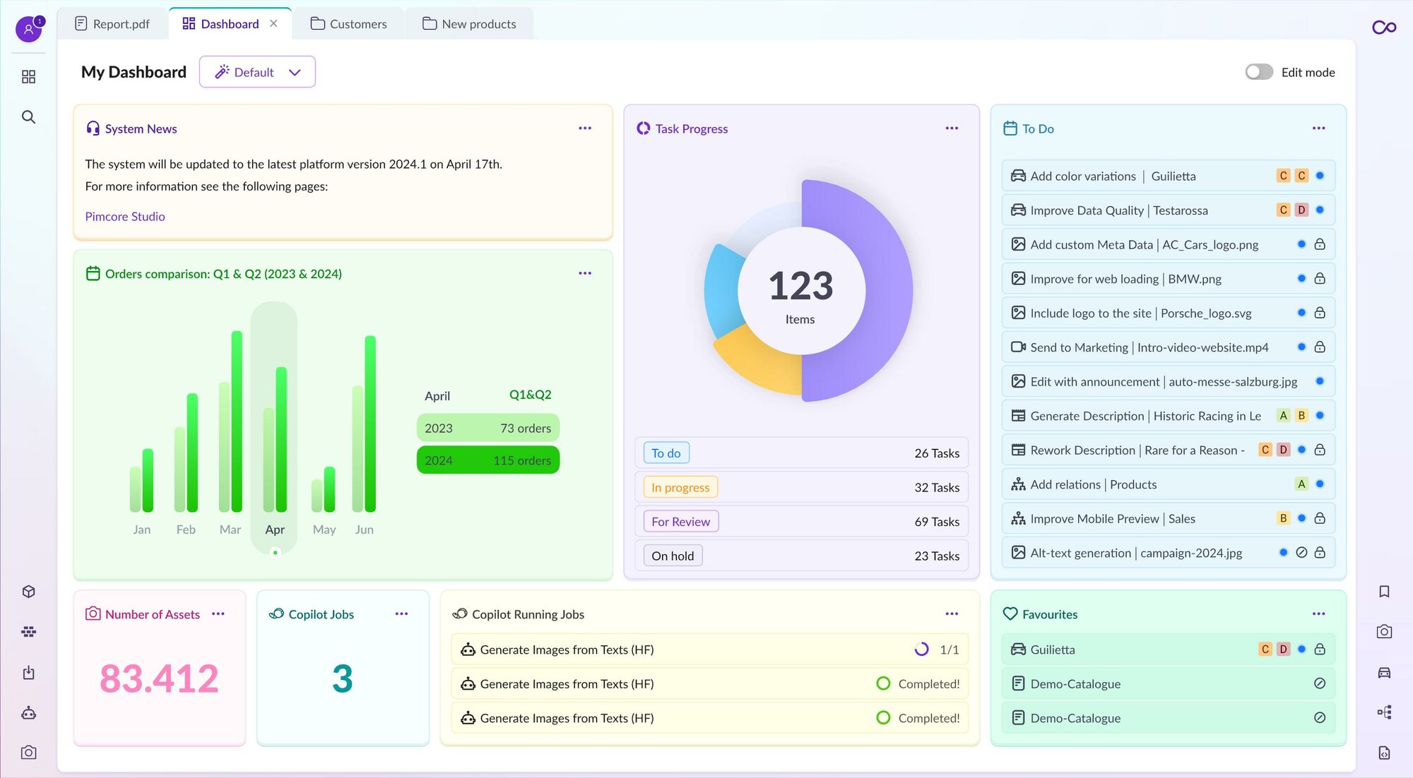
Dashboards
The new Studio UI has redesigned and reworked dashboards. It will feature beautiful, new-looking, out-of-the-box widgets that will provide helpful insights to the users and what interests them the most.
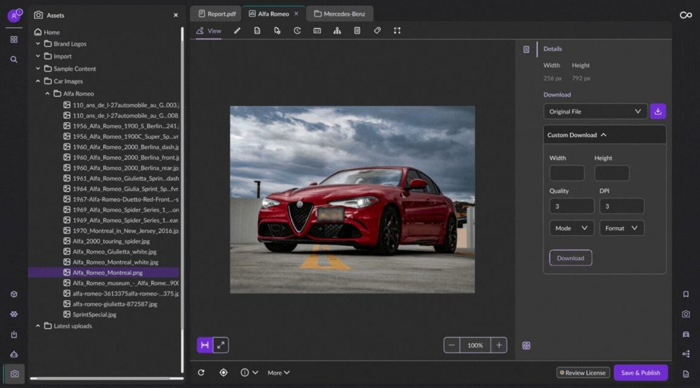
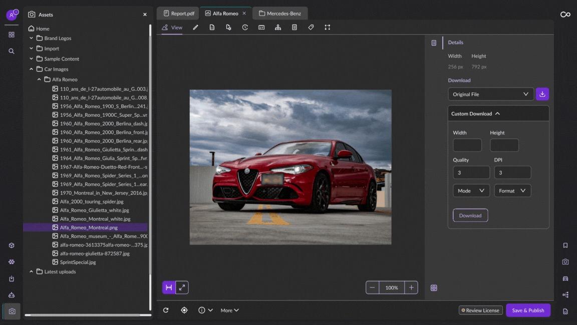
Dark mode
Last but not least, Studio UI will feature a dark mode theme as well. But that’s not all. The aim of the Pimcore in the new Studio UI is to make it customizable and themeable. For example, it could be just changing the focus colors, but it could even go further, like making fully high-contrast themes, etc.
The Technology Behind the New Studio UI
Studio UI
Technology Stack
-
React
-
Redux
-
And Design
Other tools:
-
Typescript
-
Webpack / Symfony Encore
-
Storybook
-
ESLint
-
Jest
The new Studio UI features new advanced technologies that are helpful in several ways for everybody.
React / Redux is a very trending technology worldwide and one of the most used frameworks on the planet. This makes it very feasible for developers who are kin to learn the technology. It is also a very familiar environment for existing developers, where they can quickly adopt and start using/extending the functionalities per client needs.
The tools that the new Pimcore Studio UI now uses are more oriented towards developers, like Storybook, which brings components right into the hands of developers/designers who are extending and customizing the new Studio UI.
Typescript in the heart of the code allows the use of modern type hinted, and is a truly OOP language that benefits in many ways.
In general, extending the new Studio UI should be much more efficient and easier to maintain, extend, and adopt than legacy UI and ext js framework.
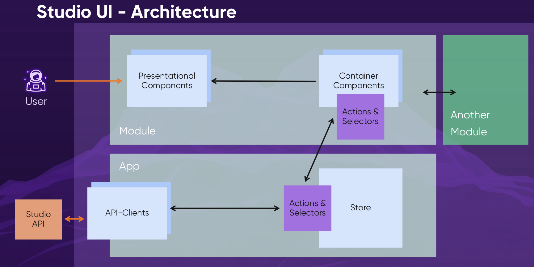
Architecture
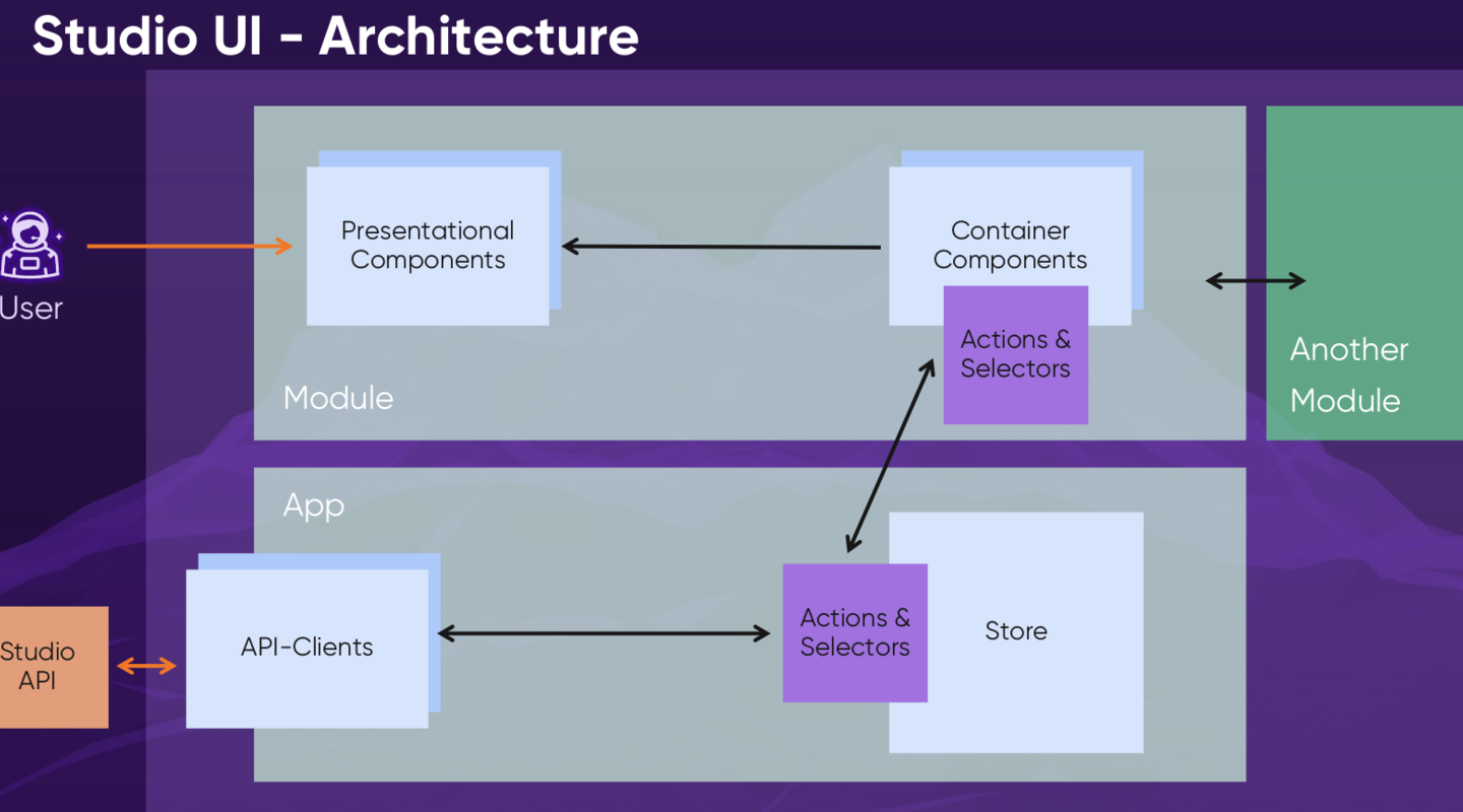
As shown in the image above, Studio UI features simple yet powerful architecture. In the backend, we have Studio API, which provides the gateway to the data and manages it.
The app part is the client application part that handles the data on the client-side application. It is used to communicate with the backend and also to store the states of the data in the Redux store but it also provides the data to the Modules, which are used to presentational components.
Presentational components are shown in container components, which allow the above-described functionality with the widgets and editors. This yet simple architecture is very powerful when it comes to extension and maintenance.
Studio API
Previous Admin API was tightly coupled with ExtJS. The new Studio API now focuses on Studio UI and covers all admin/UI tasks (filters, pagination, partial updates, etc.).
It is also compatible with third-party extensions and uses standards like JSON-LD and Hydra, and OpenAPI. It is an API platform with the rest API in the core. Using that also allows us to generate automated code documentation, which can benefit developers who want to use Pimcore’s Studio API functionalities.
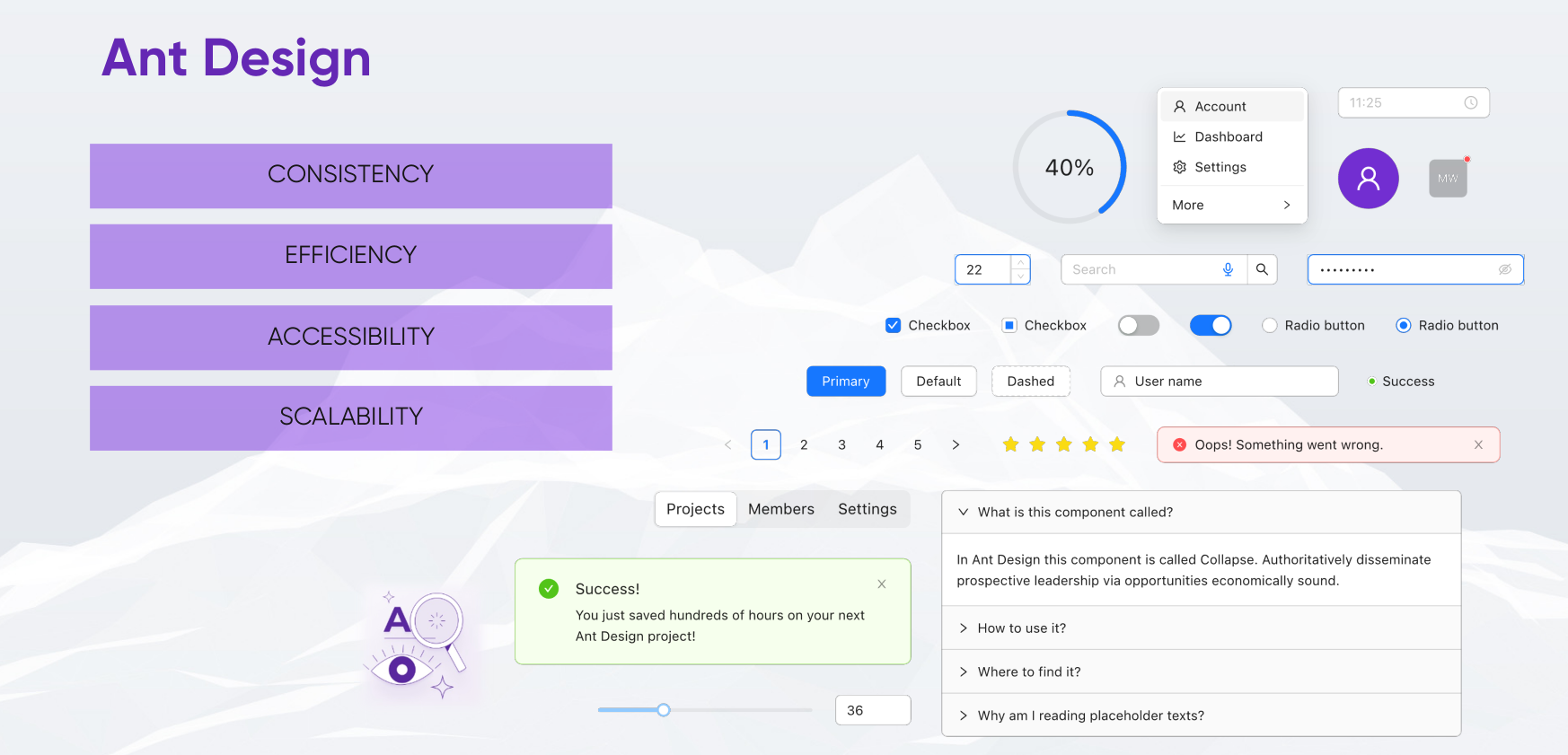
Ant Design
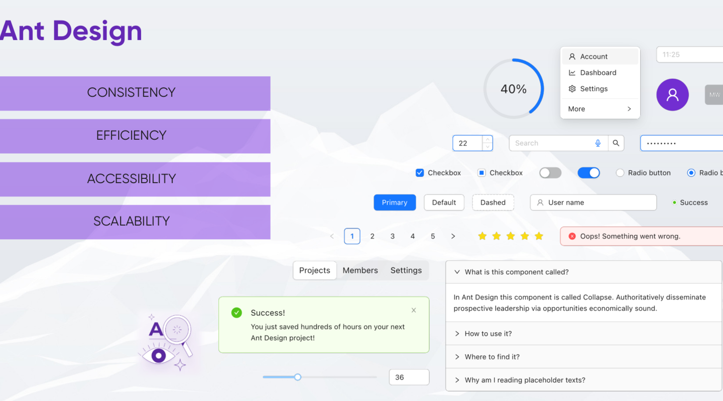
An enterprise-class UI design language and React UI library with a set of high-quality React components, one of best React UI library for enterprises.
As Pimcore is in its heart “built by developers for developers,” they still achieve the same goal because Ant Design is also dedicated to providing a good development experience.
Ant Design features:
-
Enterprise-class UI designed for web applications.
-
A set of high-quality React components out of the box.
-
Written in TypeScript with predictable static types.
-
The whole package of design resources and development tools.
-
Internationalization support for dozens of languages.
-
Powerful theme customization in every detail.
Extending new studio UI with code examples
One of the most powerful and important features of the new Studio UI is the ability to easily extend it.

To register new widget, all it takes is a few lines of code. In the above code we see a function call to registerWidgets that takes the name and the component class that is going to be used as a widget.
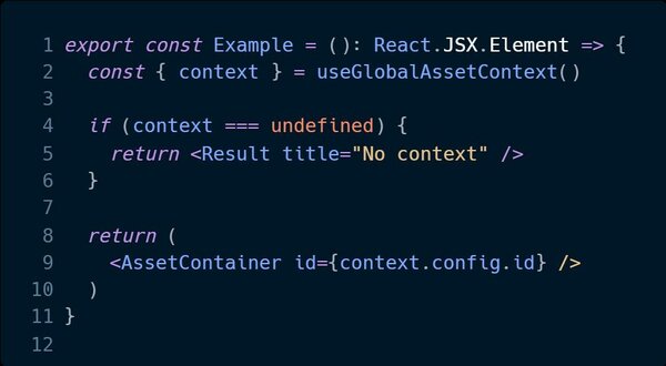
The component class is a very familiar simple react element. But what we can see is that it makes a call useGlobalAssetContext() which in the example is how interchange widgets can be constructed. So, for example, if we would have an asset opened that we could display a component AssetContainer with the id of an opened asset, which can further be used to display content based on the opened editor. Otherwise a simple Result component which would display No Context when no asset is selected on the main editor.
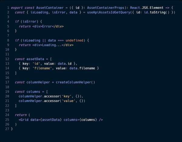
The AssetContainer is also a react component, but in there, we can use useApiAssetIdGetQuery to get information about the object that is being interacted with the main editor. We can get simple results like error, isLoading to display appropriate component ui. Finlay after we get the data we can display a grid view.
This demonstrates how very simple React components can be used to create powerful widgets. This is just a glimpse of how the new Studio UI would work from a dev perspective, and it’s really exciting.
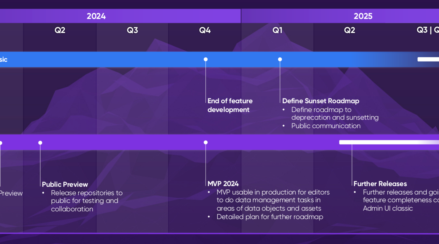
Studio Roadmap
- Beginning of Q2 2024
- Public preview: Release of repositories to the public and testing collaboration
- Q4 2024
- MVP 2024: usable in production for editors to do data management tasks in areas of data objects and assets
- Detailed plan for further road map
- End of feature development of classic UI
- Q1 2025
- Define sunset and deprecation of classic UI with the public
- Q2 2025
- Further releases are going towards feature completeness compared to classic admin UI
- Q4 2025
- Deprecating Sunseting of classic admin UI
Final words
New Studio UI brings a lot of excitement to the Pimcore world. The working demo that Pimcore showed at the Inspire conference looks even better than the screenshots. Noticeably better performance, ease of use, natural placements of UI components, the ability to easily manage widgets and have visual feedback and reactions when moving widgets around—all those features combined give more efficient editing possibilities. It is a big leap forward for Pimcore, but most importantly, for customers and editors.
But not only are customers and editors looking forward, but developers are also looking forward to getting their hands on a new development stack that will further enhance development and customer experience in pimcore, bringing even more features and new stuff.
All images in this post are courtesy of Pimcore.
